Affiliates program
 Login


The cookie banner is often the first UI element a visitor sees on a website. It shows up before the homepage has had a chance to deliver its message, and the answer it gets decides how much of the audience marketing, product and data teams will actually be able to measure.
On many sites, though, it boils down to a block of legal copy on a white background, interchangeable with the one on whatever site you visited before. The ten brands featured here went another way: with Axeptio, their banners pick up their art direction, borrow the vocabulary of their industry and, in some cases, carry a full-fledged commercial message.
Travel, cosmetics, mattresses, wealth management, footwear, crafts, soccer, opera, international basketball: the ten examples deliberately span very different industries. Each breakdown starts with the brand behind the banner, so you can see what the banner is trying to say, before looking at the design choices that set it apart from the rest of the web.
This article focuses on banner design and user experience. If you're comparing consent management platforms, see our roundup of the 5 best CMPs in 2026.
How we chose these 10 cookie banners
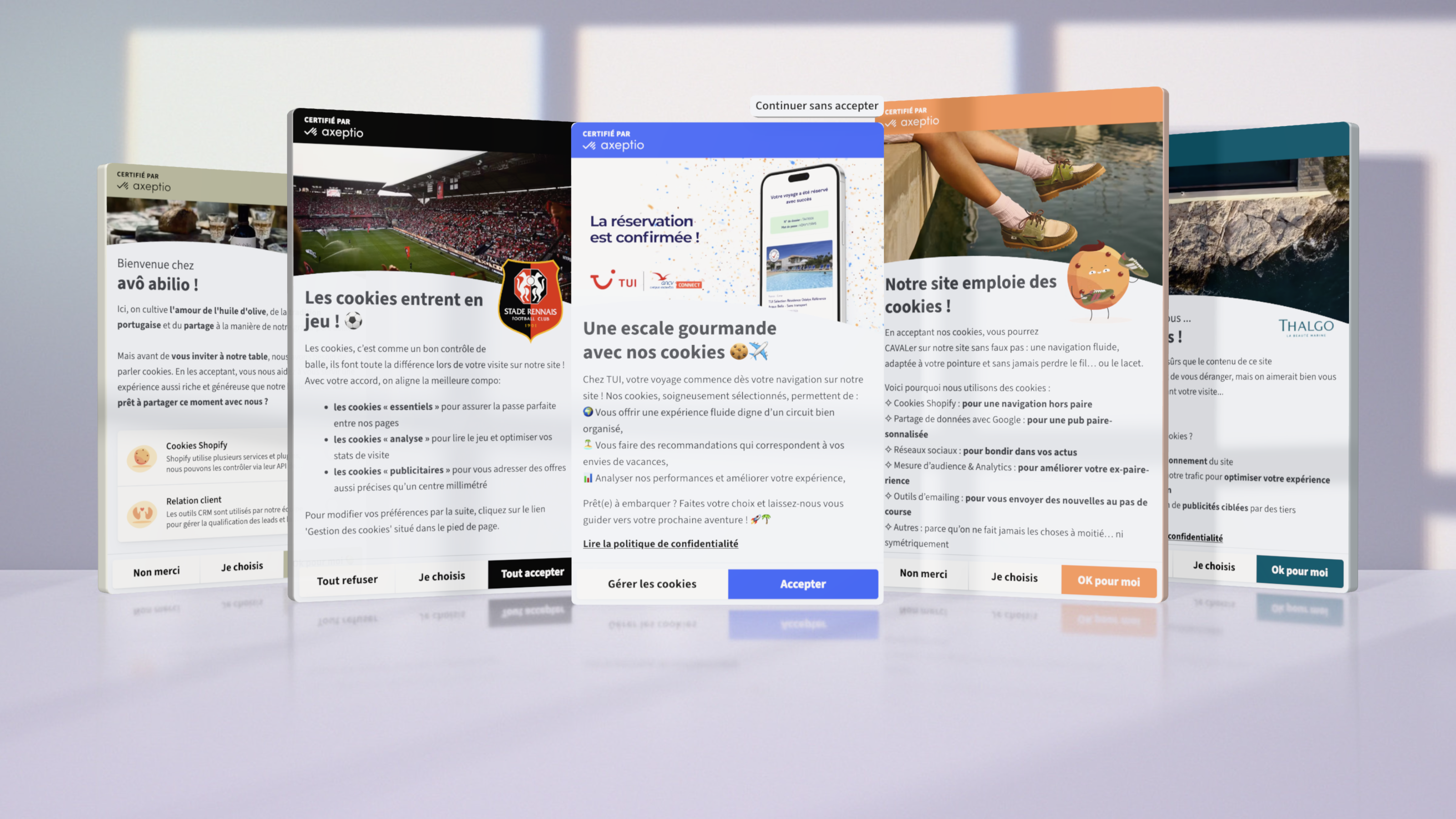
All ten examples come from Axeptio customer websites and were selected on three criteria. The first is the quality of the user experience: how readable the copy is, how clear the choices are, and where the banner fits into the browsing journey. The second is the marketing experience, meaning how consistent the banner is with the brand's identity and how well it gets a message across. The third is performance, as measured in the Axeptio dashboard.
Performance comes down to three metrics. The interaction rate is the share of visitors shown the banner who make a choice, whatever that choice is. The consent rate is the number of acceptances divided by the number of visitors who interacted. The opt-in rate divides consents by every visitor shown the banner: it's the number that sets how much data you can actually use.
For each banner, we looked at the same components:
- Format and placement: a compact banner in a corner of the page, or a cookie wall centered on the screen.
- Display delay: right away, or after a few seconds of browsing.
- Header visual: none, a still image, or a video embedded at the top of the banner.
- Styling: colors, logo, illustrations and the shadow effect, which ranges from a subtle drop shadow around the banner to a tinted overlay across the entire page.
- Copy: headline, tone, and how the banner explains what cookies are for, all the way into the customization panel.
- Buttons: how the accept, reject and customize options are laid out, with equal prominence so that rejecting is as easy as accepting (what European regulators call consent symmetry).
- The pebble: the small badge that lets visitors reopen the banner at any time, which some sites back up with a link in the footer.
Most of these banners run in French only. So for our english-speaking audience, we translated the copy and kept the French original wherever the wordplay depends on it.
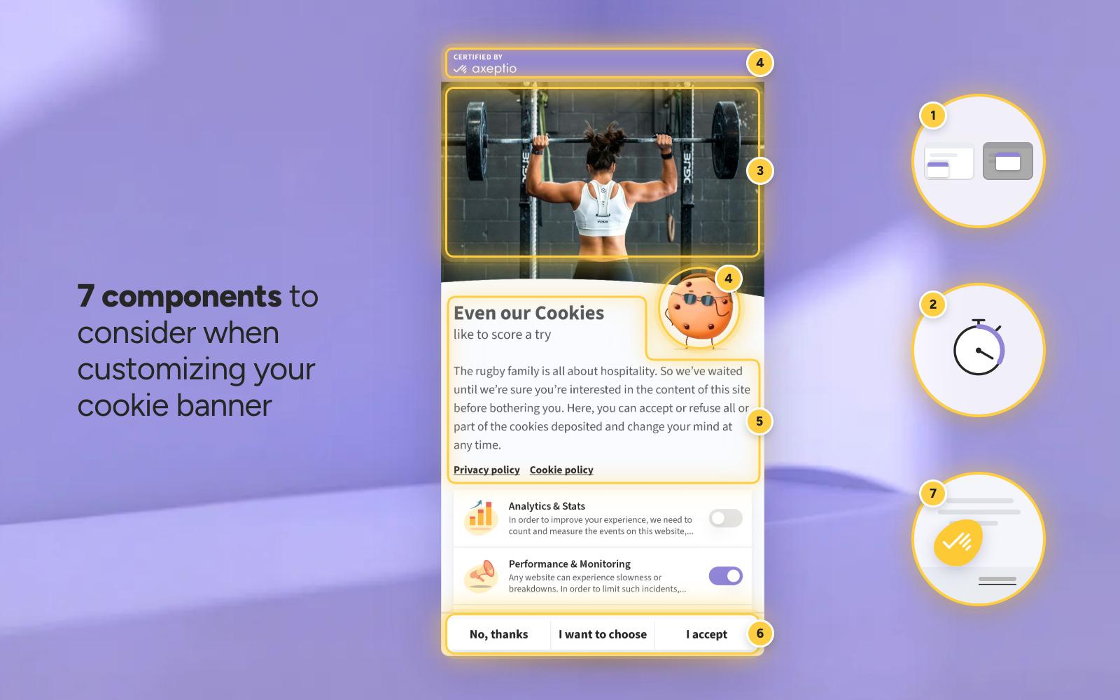
10 cookie banner design examples
1. TUI France: a banner built to welcome visitors, then put to work as a media channel
TUI France is the French subsidiary of the TUI Group and the leading travel company in the French market. It combines tour operating and travel retail across four brands: Club Marmara and Club Lookéa for club resorts, Nouvelles Frontières for multi-stop tours, and TUI Sélection for partner hotels. It also runs a network of more than 200 TUI Stores across France.
In a store, visitors are welcomed by a travel advisor; online, the CMP is the first screen where that sense of hospitality can come through. So the copy speaks the language of travel, from the headline, "A sweet layover with our cookies 🍪✈️," to the sign-off, "Ready to board?" In between, each purpose is reframed as a benefit for the user and introduced by an emoji: a smooth experience "as seamless as a well-run tour," recommendations matched to your vacation plans, and performance analysis to improve the journey.
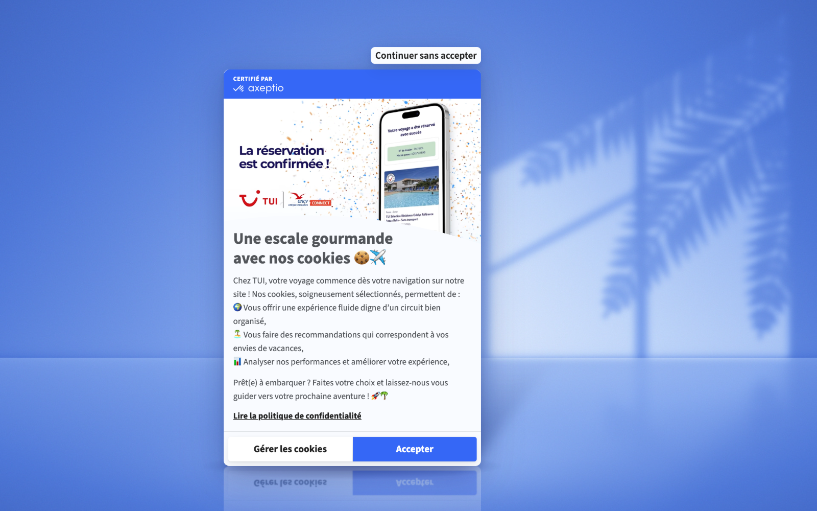
The timing follows the same logic. The banner appears after a few seconds, giving visitors time to settle in on the site, then opens as a cookie wall in the center of the screen, without dimming the page. The design is built around a wave that echoes the one in the TUI logo. The brand's blue fills the top band and the "Accept" button, which is the same size as "Manage cookies," while rejecting goes through a "Continue without accepting" tab sitting just above the card.
What really sets this banner apart is the embedded video at the top. It autoplays on mute, and two discreet buttons let visitors turn the sound on or pause it. TUI France first used it to announce the launch of its mobile app, along with €30 off a future trip, repurposing a video produced for its other campaigns. The message has changed since: the video now promotes payment with Chèques-Vacances Connect, the digital version of the vacation vouchers widely used in France. The banner has become a media placement the brand refreshes whenever it has news to share.
The full strategy, along with how consent is handled in the mobile app, is covered in our white paper on TUI France.
2. Thalgo: a delayed banner that tells visitors why it waited
Thalgo, the first French laboratory to specialize in seaweed-based skincare, now presents itself as the world leader in professional marine cosmetics, available in more than 15,000 beauty salons, spas and thalassotherapy centers worldwide.
As with TUI, the banner only appears after a few seconds of browsing. The difference is that Thalgo adjusts its message to match. Below the headline, the copy opens with: "We waited until we were sure you liked what you saw before bothering you, but we'd love to keep you company while you're here." A display setting becomes a small courtesy toward the visitor. The copy then asks what cookies are for and answers in three lines: keeping the site running properly, analyzing traffic to improve browsing, and targeted ads from third parties.
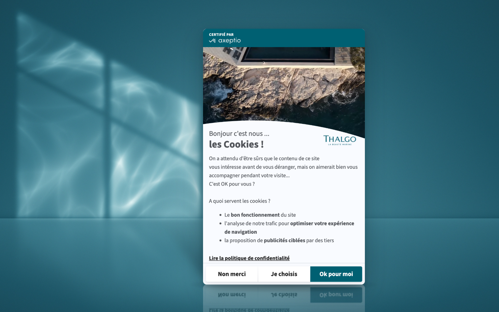
The header plays a brand film running just over a minute and a half, on autoplay: a rocky coastline at sunset with the logo superimposed, kelp underwater, lab tubes filled with seaweed, a bottle resting on rocks, then a treatment in a spa room. In a handful of shots, the video traces the brand's journey from the sea to the lab to the spa, true to the #lamervousveutdubien ("the sea wishes you well") hashtag Thalgo uses on social media.
The blue header band and the logo next to the headline complete the branded look, while a blue-gray shadow veils the rest of the page to draw the eye to the banner.
3. Merinos: a bright, user-friendly cookie wall that invites visitors to choose
Merinos describes itself as a French mattress brand that is modern, simple, comfortable and affordable. Its mattresses have been made in Vesoul, in eastern France, since 1958 and are tested in France, a commitment that has been part of the brand's DNA from day one.
The brand's first decision on consent was about placement: the banner appears as a centered cookie wall rather than in a corner of the page. Its shadow, set to white and stretched across the whole window, brightens the rest of the site. The card stands out without the page looking switched off, and visitors are nudged to make a choice instead of browsing on without answering, which directly lifts the interaction rate.
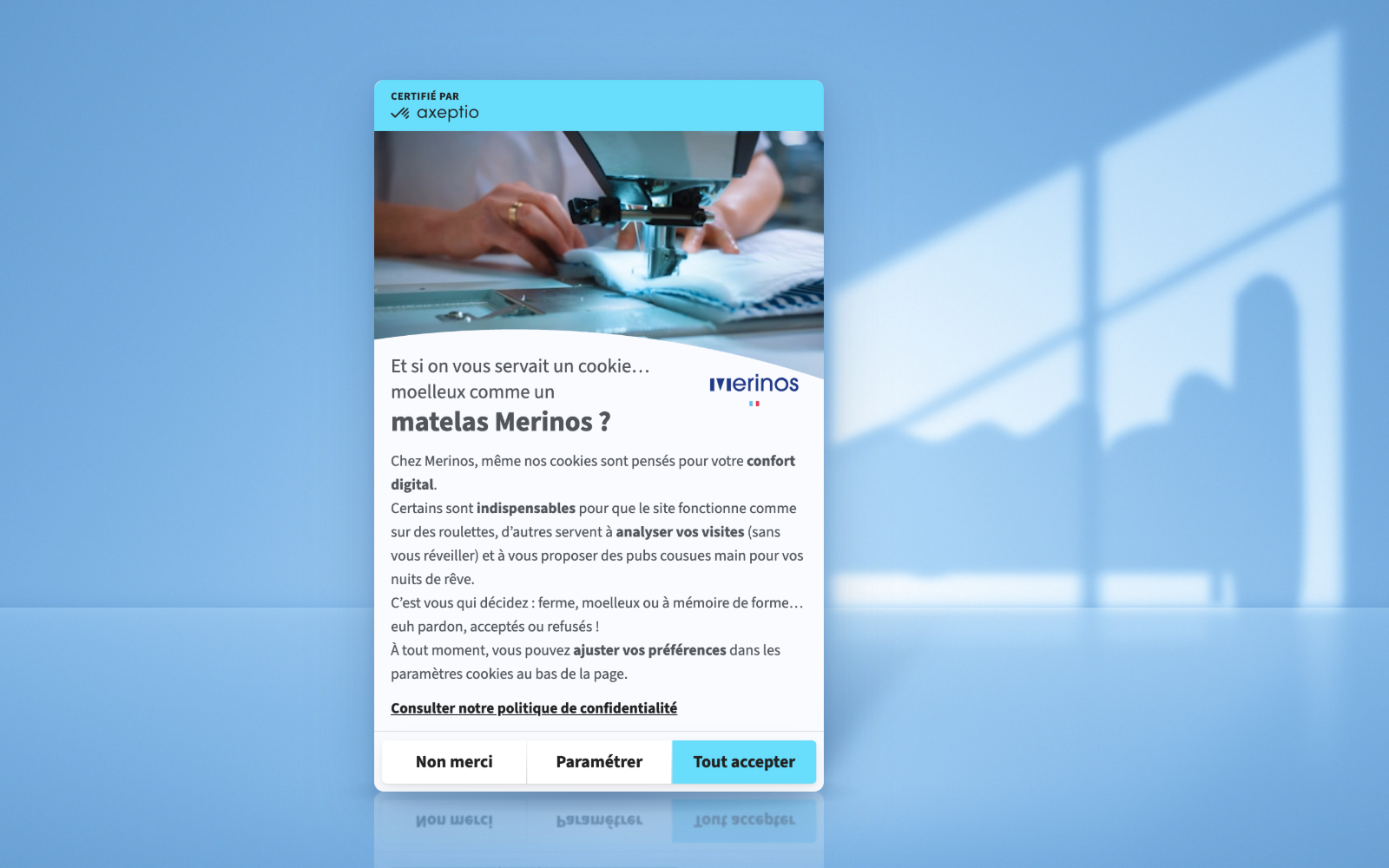
The copy runs a bedtime metaphor from start to finish. The headline offers a cookie "as soft as a Merinos mattress," essential cookies keep the site running "smooth as silk," audience measurement analyzes visits "without waking you up," and the closing line borrows the product's own vocabulary: "firm, plush or memory foam… um, sorry, we meant accepted or declined!" The cyan header band and the logo with its small French flag anchor the banner in the brand's identity.
The header video, a loop of about fifteen seconds, takes visitors behind the scenes: hands at a sewing machine, employees in the workshop, the blue-and-white rooster that serves as the brand's mascot, the factory, and the Vesoul city-limits sign. The choice ties in with Merinos's message about mattresses made "by real people": before even browsing the catalog, visitors meet the people who make the products. Merinos was also an early tester of video in the Axeptio banner, reusing a film originally produced for its own marketing.
4. Deco Cuir: a workshop tour, right in the consent banner
Deco Cuir is a French company specializing in leathercraft. Since 2009, it has been helping hobbyists and professionals with their leather goods, saddlery, bookbinding and upholstery projects, with more than 17,000 products online. It also runs France's largest store dedicated to leatherworking, in Campbon near Nantes, where craftspeople lead training sessions and workshops every month.
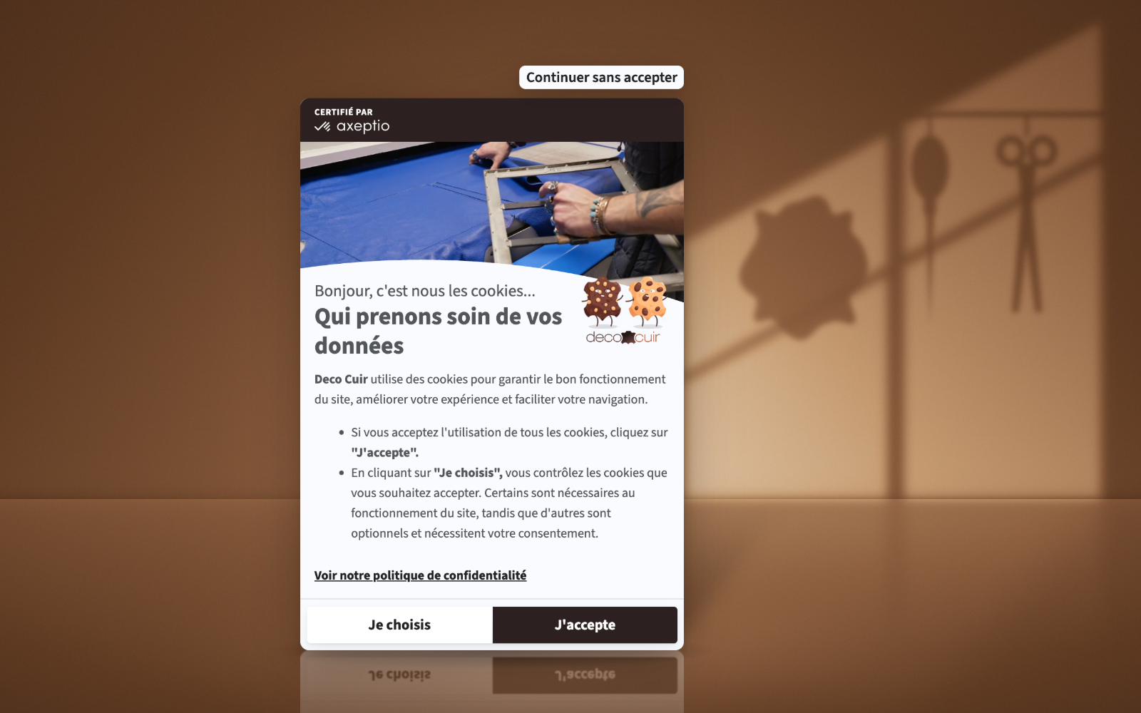
The header video, a loop of about thirty seconds, shows the company at work: a cutting machine in the workshop, a hide being die-cut, a thickness check, shelves stacked with rolls of leather, but also the warehouse and order packing, with the logo overlaid. The film covers both sides of the business: hands-on leather expertise, and the logistics of an online store that ships worldwide. Deco Cuir also chose to feature two custom cookie characters that bring a playful touch to the consent step.
The banner only appears after several seconds, in the bottom-left corner of the screen. Its shadow, tinted the same dark brown as the header band, veils the page behind it: the brand color carries through even to the highlight effect.
5. Insinia: tailored wording and a pebble that says what it does
Insinia is a brand of Groupe Astoria, which has 55 offices in France and serves 120,000 clients and families in wealth management. Strategic advice, financial and real estate investments, family office services: the brand defines itself by an individualized, personalized approach to wealth, built on the conviction that every client deserves a tailored strategy.
The banner's headline carries that promise over to consent: "Your experience deserves tailored management." The understated copy closes with a line that sums up the brand's stance: "Your choice stays front and center." A navy header band, a gold logo beside the headline, a "Continue without accepting" link set in white inside the band: the hushed, discreet tone is exactly what clients expect when they come to entrust someone with their wealth.
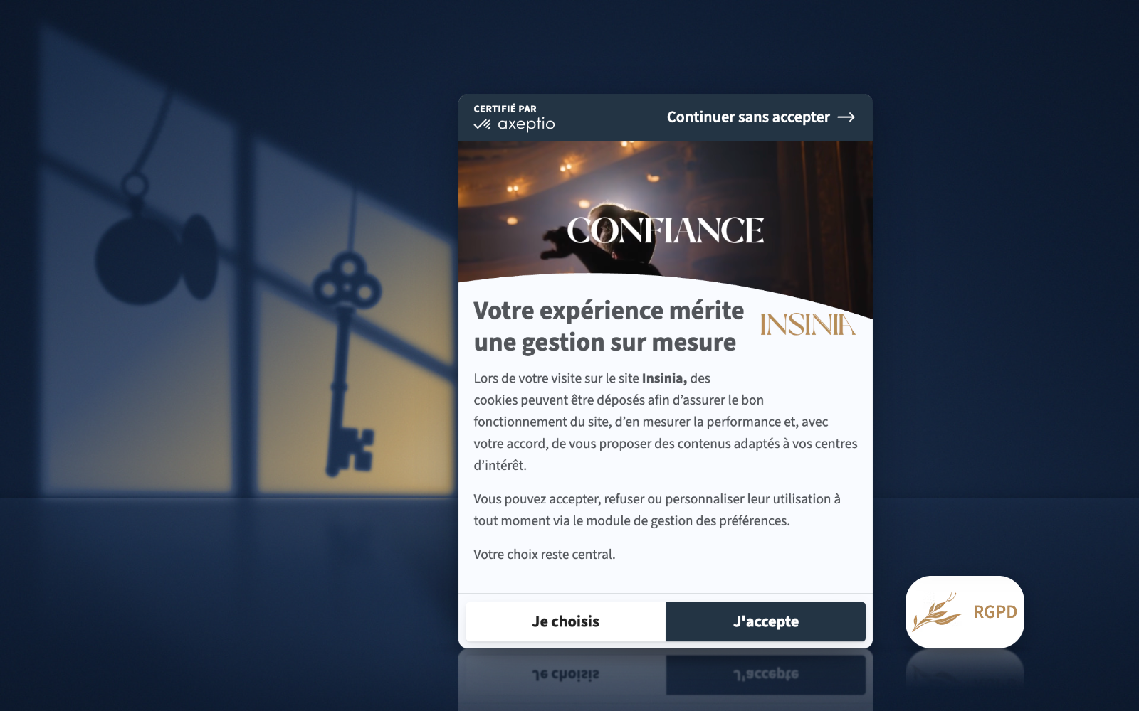
The header video strings together scenes aimed at that same clientele, with life moments that illustrate the goals the brand highlights on its site: protecting your family, planning for retirement, passing on your wealth. Placed in the bottom-left corner with a light shadow, the banner simply stands out against the site's dark background.
Insinia also reworked one more element: the pebble, the small badge that reopens the banner, decorated with a gold sprig and the letters "RGPD" (the French acronym for GDPR) in the same gold as the logo. For an audience that isn't familiar with the topic, the acronym makes the button's purpose clear at a glance, and the badge, visible from the moment visitors land, carries the brand guidelines all the way down to this detail.
6. avô abilio: a banner that carries on the brand's story
avô abilio is a shop "inspired by saudade," that gentle Portuguese nostalgia. Created by Manon and Amélie, it pays tribute to Manon's grandfather, Abilio, born in 1917 in the Douro Valley. Extra virgin olive oil, artisanal soaps, ceramic swallows, upcycled textiles: the products are handmade by families of producers and artisans from northern Portugal and the Hérault region in the south of France.
More understated than the previous examples, this banner makes no attempt to stand apart from the site. No overlay on the page, a light shadow around the widget, a sage-green header band matched to the shop's palette: the effort goes into the storytelling. Under the headline "Welcome to avô abilio!", the copy picks up the family story: "Here, we cultivate a love of olive oil, Portuguese tradition and sharing, just like our grandfather abilio. But before we invite you to our table, we need to talk cookies." It then extends the metaphor, promising an experience "as rich and generous as our olive oil."
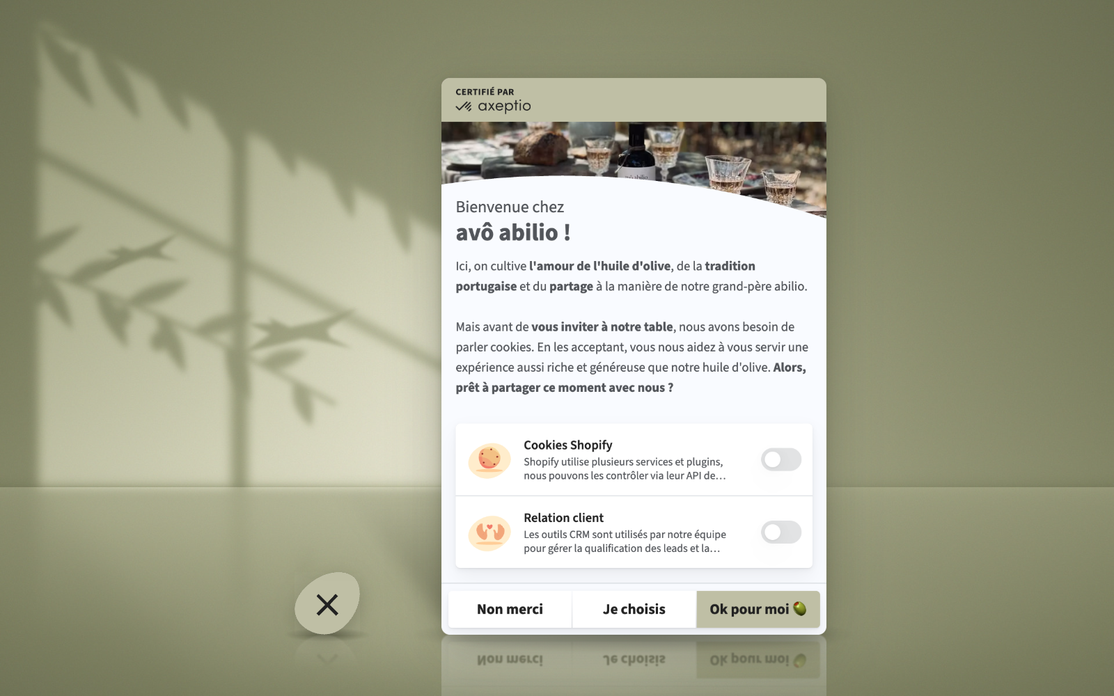
The header photo shows a table set outdoors with a bottle of avô abilio: picture and words set the same scene. Long for a banner, the copy works because it reads like an invitation, in the same spirit as the handwritten note tucked into every order. An olive emoji on the "Fine by me" button keeps the wink going, all three buttons sit on the same level, and the badge that reopens the banner is shaped like a smooth stone in the same sage green.
The example shows that a smaller brand can get a distinctive banner without producing a video it can't afford: copy written in the brand's voice and careful visual integration are enough.
7. Caval: shoe puns all the way into the cookie purposes
Caval designs shoes and clothing handmade in Portugal. Its tagline, "Walk Different," sums up the brand's founding idea: flipping lines, materials and colors from one shoe of the pair to the other to "twist" the rules of symmetry. All its pairs are unisex and made in Europe.
Where avô abilio blends in, Caval goes for contrast: the light card, topped with an orange band, stands out sharply against the site's current burgundy background. The header shows a photo from the collection, and an orange cookie character spills out below the image, holding a sneaker in each hand, fully in tune with the codes of the category. The banner doubles as a product showcase the brand can refresh with every new collection.
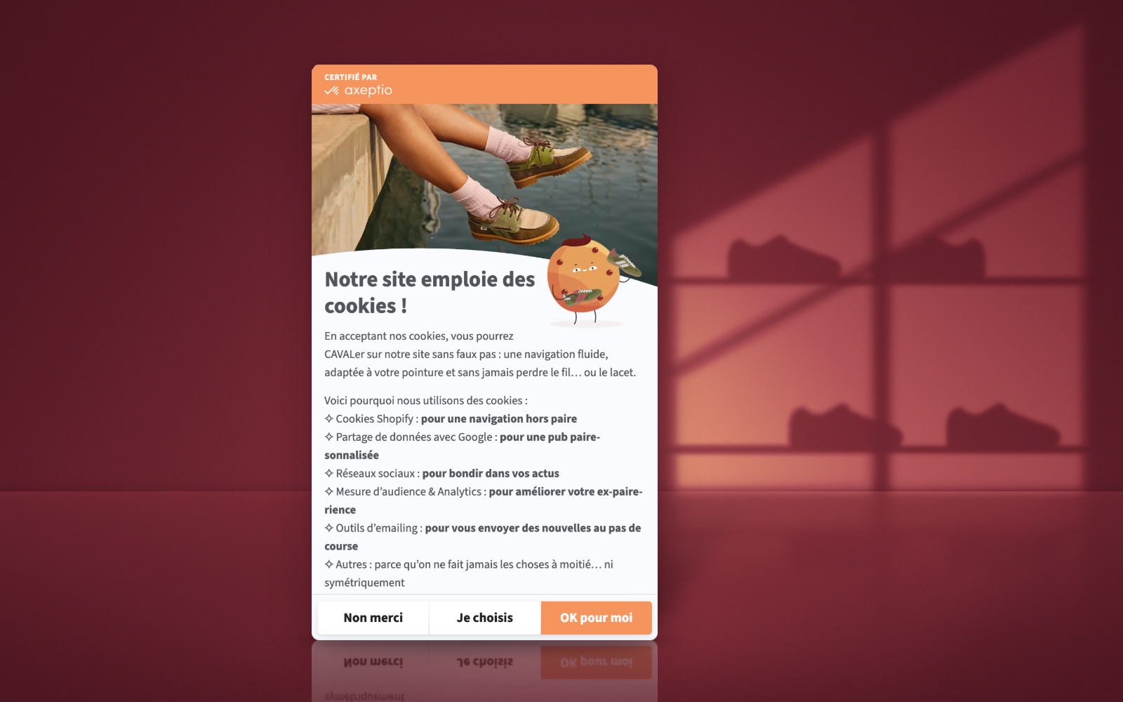
The copy is the banner's strongest asset. Under a plain headline, "Our site uses cookies!", it invites visitors to CAVALer around the site "without a faux pas" (the brand name doubles as cavaler, French slang for dashing around), with browsing "fitted to your shoe size, without ever losing the thread… or your laces." Each purpose then gets its own pun: "pair-sonalized" ads, an improved "ex-pair-ience," and a final category justified "because we never do anything halfway… or symmetrically." The three buttons, for their part, sit on the same line at the same size: a brand that built its identity on asymmetry applies strict consent symmetry in the one place where it's required.
8. Stade Rennais: a big crest to rally the fan base
Stade Rennais Football Club was founded on March 10, 1901, making it one of the oldest soccer clubs in France. Currently in Ligue 1, France's top division, the red-and-black club has won the Coupe de France, the country's national cup, three times.
A soccer club speaks to its fans first, and this banner is designed for them. The header shows a packed Roazhon Park, red stands and tifo displays unfurled. The club crest, the red-and-black shield dated 1901, overlaps the photo at a far larger size than the discreet logos most brands settle for.
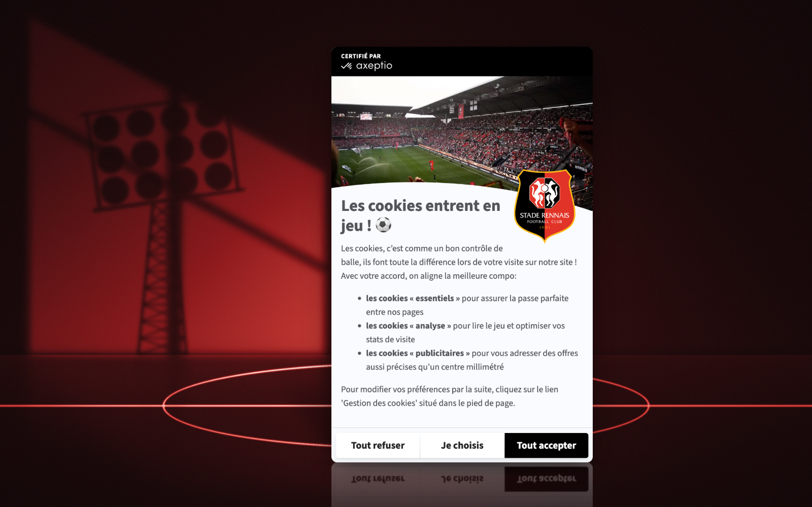
The headline, "Cookies take the field! ⚽️", kicks off copy written entirely in soccer lingo. Cookies are compared to "good ball control," the club "fields its strongest lineup," and each purpose gets its own image: "the perfect pass between our pages" for essential cookies, "reading the game" for audience measurement, and offers "as precise as a pinpoint cross" for advertising. The black shadow, stretched across the whole page, darkens it and works like a spotlight on the banner, which helps lift the interaction rate.
9. Paris Opera: a pared-back banner that leaves the stage to the site
The Paris Opera (Opéra national de Paris) stages operas, ballets and concerts every season across two venues, the Palais Garnier and the Opéra Bastille. Its website serves as both artistic showcase and box office for one of the best-known cultural institutions in the world.
A longtime Axeptio customer, the Opera worked on the tone of its banner early on: a previous version, designed as an "opera cookie" and written in the language of the stage, was the subject of a customer story on our blog. The current version takes the opposite approach to the examples above: no image or video in the header, and a banner far more pared-back than the others.
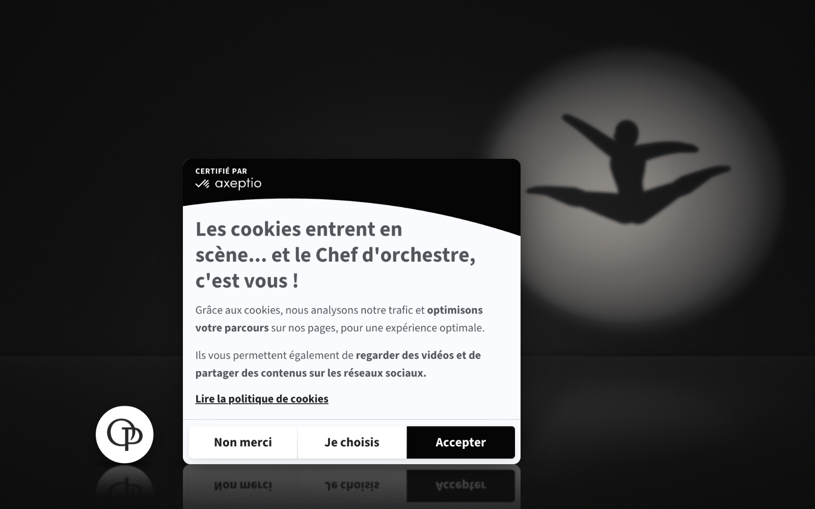
That choice comes down to the nature of the site, whose homepage is taken up by large production images that remain visible, slightly dimmed, behind the banner. An extra image would have competed with them. So the banner sticks to a black-and-white palette with no logo, and a black header band ending in the curved cutout that is a signature of Axeptio's design.
The restraint leaves the spotlight on the season's productions and gives the whole an elegance in keeping with the institution. The only visible signature is the badge that reopens the banner, a white circle stamped with the "OP" monogram.
The copy therefore carries most of the banner's personality: "Cookies take the stage… and you're the conductor!" The line reminds visitors that they stay in control of their choices, and it does so without breaking character.
10. FIBA: customizing a banner within the constraints of the TCF
Founded in 1932, the International Basketball Federation (FIBA) is the only basketball authority recognized by the International Olympic Committee. From its headquarters in Switzerland, it oversees 212 national federations and organizes events including the FIBA Basketball World Cup and EuroBasket. Online, it aims to become the world's go-to destination for basketball, with a dedicated site for each competition and an audience spread across every continent.
Some of FIBA's sites run programmatic advertising. The federation uses the Transparency & Consent Framework (TCF), the IAB Europe standard that lets publishers pass visitors' choices on to their advertising partners. The standard mandates specific purposes and required disclosures, which leaves far less room for customization.
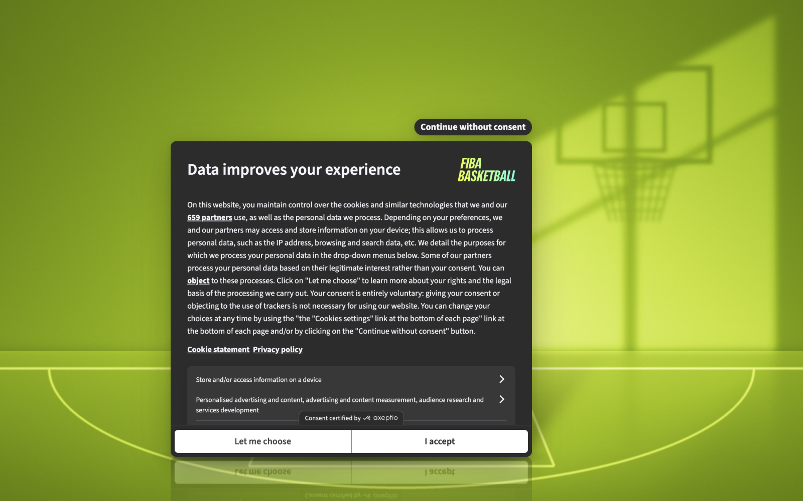
The fiba.basketball banner shows what's still possible with Axeptio for Publishers. Its format differs from the other nine examples: a wider window, centered on the screen, that presents the main purpose categories as expandable menus and displays the number of advertising partners.
The styling, on the other hand, is all FIBA. The window uses a dark theme, which makes the yellow-to-green gradient of the FIBA Basketball logo in the top-right corner stand out all the more. On FIBA's other sites, the banner picks up each competition's own colors and logos, and runs in several languages. For the full story, download our white paper on the FIBA project.
Cookie banner design best practices
These ten banners take different approaches, but they share a common set of principles that work in any industry.
- Match placement and prominence to your goal. A centered cookie wall encourages interaction (Merinos, TUI France). A shadow stretched across the whole page focuses attention on the banner (Thalgo, Stade Rennais), simple color contrast is enough on a site whose background already carries a strong color (Caval), and a banner that blends into the site's palette plays on discretion or elegance (avô abilio, Paris Opera).
- Tint the shadow in your brand colors. White at Merinos, brown at Deco Cuir, black at Stade Rennais: the color of the shadow carries the visual identity right into the highlight effect.
- Hold the banner back a few seconds. Visitors get to take in the page before being asked anything (TUI France, Deco Cuir). Saying so in the copy turns the delay into a courtesy (Thalgo).
- Write a headline in your industry's language. A short line is enough to set the tone.
- Turn purposes into user benefits. Visitors should understand what cookies do for them without having to decode legal language. An extended metaphor, from mattresses to soccer, makes the explanation far more playful (Merinos, Caval, Stade Rennais).
- Keep the brand voice from start to finish. The tone should carry through from the main copy to the customization step (Paris Opera), even if that means writing longer than standard copy, as long as it stays natural and easy to read (avô abilio).
- Give the video a clear job. Brand film, craftsmanship, the faces behind the brand or a commercial announcement: video works when it carries a message (Thalgo, Merinos, Deco Cuir, TUI France). Played on mute, with buttons to turn the sound on or pause it, it doesn't force itself on visitors.
- Repurpose existing content and refresh the message. Brand films and campaign videos you've already produced get one more distribution point in the banner, with no new production costs.
- Scale the visuals to the site. On a site that's already image-heavy, a pared-back banner lets the background do the work (Paris Opera). A still photo is often enough to anchor the banner in the brand's world, especially when it illustrates the copy (avô abilio, Stade Rennais).
- Carry the visual identity all the way to the pebble. An "RGPD" badge (Insinia), a monogram (Paris Opera) or a stone-shaped badge in the shop's colors (avô abilio) help visitors find their settings again without leaving the brand's world. When the pebble is hidden, a footer link should take over so users can easily revisit their choice.
- Measure and test every change. Tracking interaction, consent and opt-in rates after each change, and comparing variants with Axeptio's A/B testing feature, is how you land on the best-performing setup.